Curology OFFICE DESIGN
YEAR: 2019
CLIENT: CUROLOGY
LOCATION: san francisco, caLIFORNIA
ROLE: INTERIOR ARCHITECT
COLLABORATOR: f2 design
_____
CHALLENGE
Curology, a skincare company, was using WeWork for their offices until their team started to quickly expand. Their immediate need was an office space they could call their own. The ask was to create a space that encompasses the Curology brand: modern, fresh, young, communicating credibility while still evoking a unique personality.
THE SOLUTION
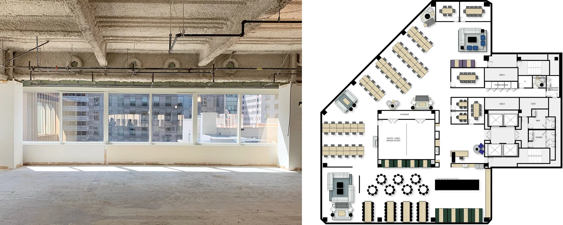
Starting with a completely empty slate, the programming and floor plans were mapped out for the two floors. We had only one month to work on the interior so the design process began quickly with material selection, spacial design, lighting, furniture, and finishes.
THE CAFE
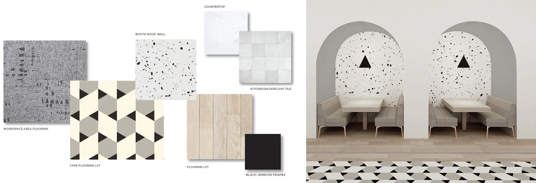
The heart of the office is the cafe which spans a large portion of the office space. The elements include a kitchen, a long center island where daily food delivery can be served on, ample seating for day-to-day use, a space for monthly company all hands meetings, and comfortable lounge seating. The ask for the space was to make it look like a commercial restaurant and for it to be functional, stylish, comfortably seat 100 people and of course, be done on a budget. In order to create a showpiece and focal point on the floor, an LVT product was found where geometric shapes could be pieced together for a custom look. Using LVT in the place of tile enabled the use of other higher end finishes for the kitchen and seating nooks, with a commercial finish.
THE WORKSPACE AREA
Acoustic felt panels hang in the workspace area to create a quiet and focused area for employees to do their best work. Black is brought in as an element on the ceiling and walls to counter the natural light pouring into the space. Felt lighting is used throughout the workspace area adding another layer of acoustics. Large whiteboard panels slide in front of a black cork board inviting collaboration.
The conference room glass grid was inspired by Piet Mondrian, the abstract artist whose paintings of the 1920’s created asymmetrical balance with clean lines and architectural beauty.
A few little surprises can be found throughout the space like the influencers wall where visitors can capture the spirit of Curology. Employees can hide away in little nooks to take a break or to work out the details of the next big thing in skincare.


